We've refreshed the design. Here's what moved and why.
Improvement
We've given the app a design refresh. New sidebar navigation, clearer wayfinding, and the start of a proper design system.
The top navigation was getting crowded. Panels, projects, settings, all in one bar, and more features on the way with nowhere to put them. So we’ve reorganised the app (not the participant-facing portal, that’s untouched). As part of the refresh to Participant Kit, we’ve rethought how the app is laid out and tidied things up.
Nothing has functionally changed. This is about making the experience clearer and easier to navigate.
Before
After
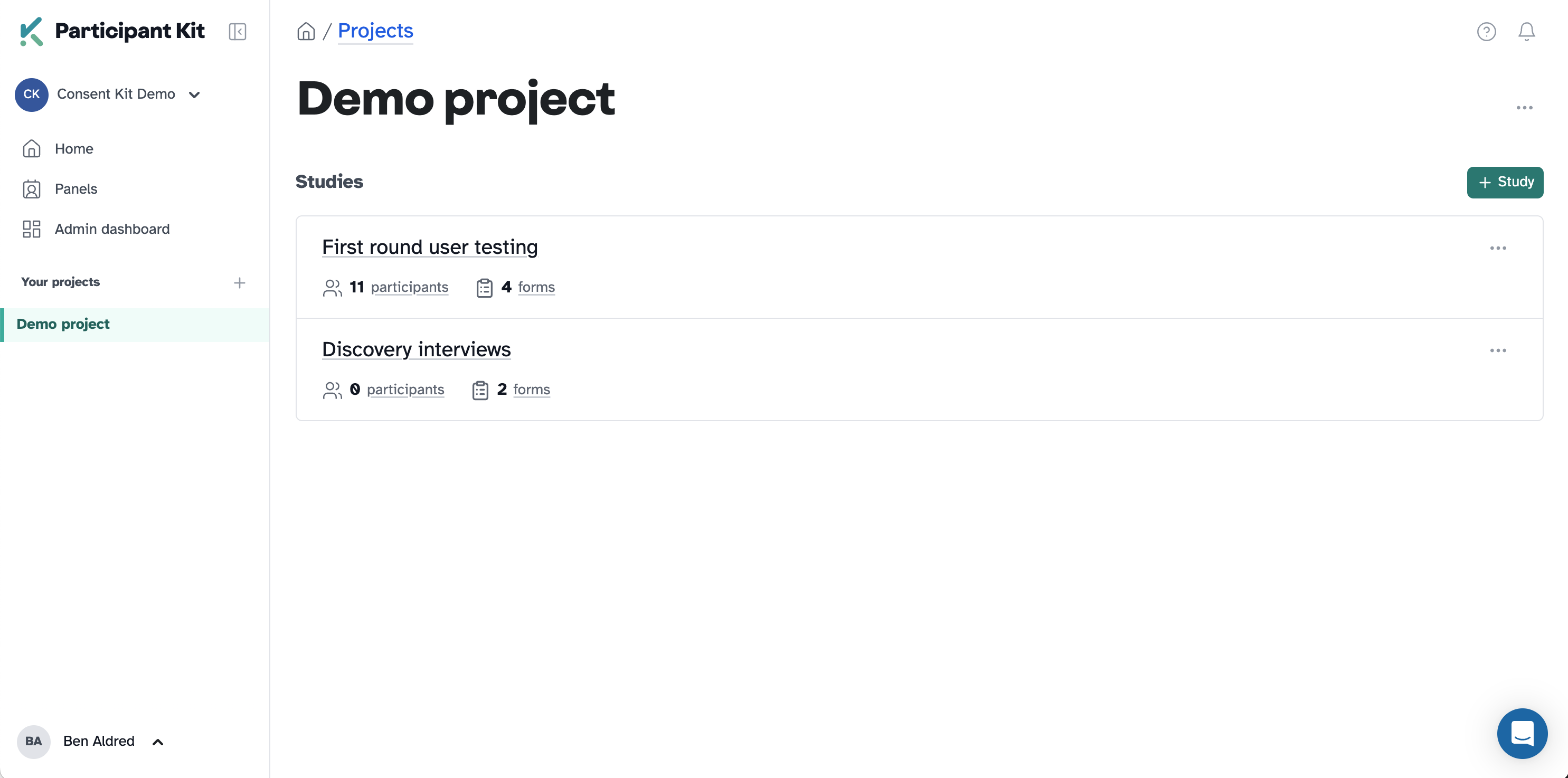
The sidebar
Navigation now lives in a collapsible sidebar on the left. Your projects are listed there, your user menu is at the bottom, and there’s room for what’s coming next without everything fighting for space.
Knowing where you are
Previously, all studies within a project sat on the same page in a concertina pattern. You’d expand one, collapse another, and it was easy to lose your place. I can feel the designers among you rolling your eyes. 🙄
Each study now has its own page. You can see them as a list within a project, click into one, and focus on it without the clutter. The breadcrumbs have been reworked too, so you always know whether you’re in a project, a study, or a settings area. The structure is simpler and the navigation is consistent. No guessing.
Over time, this gives us space to add things like usage statistics and study overviews that would have been too crowded before.
A proper design system
Every screen is starting to follow the same structure: consistent headers, page titles, descriptions, and button styles. We’re documenting the design system as we go, so you should see more consistency creeping in over the coming weeks.
Accessibility
Participant-facing pages remain WCAG 2.2 AA compliant, as audited by the RNIB. We’re also working towards WCAG 2.2 AA on the researcher-facing side, and this refresh gives us a solid starting point. More detail in our accessibility statement.
One thing to note: some help docs still have older screenshots. We’re updating those over the next few weeks.